
FV + AI
regional
--bcai-signal-steel
Design guidelines
The press kit says what the BC + AI brand is. This page says how to build with it: the spacing, radius, elevation, layout, and control rules a new page or component is held to, each one resolving from a token that already ships.
Scope
Two documents, one system. Read the right one for the job in front of you.
Identity, voice, colour roles, typography, photography, motion, and logo downloads live in the press kit. They are not repeated here, because a value written down twice is a value that drifts. This page adds the build layer that had no owner before: spacing, radius, elevation, layout, and controls.
Identity
BC + AI is identified by type, not by a symbol. The chrome sets it in the mono face, uppercase, with wide tracking, and that is the whole mark.
Clear space: the cap height of the B on every side.
Chrome size, 14px. Do not set it smaller; the tracking closes up.
Keep clear space around the wordmark equal to the cap height of the B on every side.
lib/press-kit/brand-contract.ts
Do not set the wordmark below its 14px chrome size. Below that the 0.18em tracking closes up and it stops reading as a mark.
lib/press-kit/brand-contract.ts
Do not recolour, rotate, outline, condense, or add effects to the wordmark, and never set it in a different typeface. Keep a space either side of the plus.
lib/press-kit/brand-contract.ts
Do not reintroduce the DNA-helix identifier or any other symbol as a logo. BC + AI is identified by its wordmark.
lib/press-kit/brand-contract.ts

The DNA-helix square is a previous identifier. It is not current, and it must not be reproduced in new work. It is still the file the press kit serves as a downloadable logo mark, which is a live conflict rather than an endorsement. If you were handed that file, you were handed the old identity.
lib/press-kit/brand-contract.ts
Downloadable files, formats, checksums, and the formats BC + AI cannot clear: press kit downloads.
Colour
Every value below is read from app/globals.css when this page is built, so it cannot drift from the system it documents.
Page canvas
#0a0d12
--bcai-bg
The default root for every route.
Elevated canvas
#11151c
--bcai-bg-elevated
Panels and section separation.
Paper
#f4f4eb
--bcai-paper
Print-adjacent and evidence surfaces.
Media black
#05070a
--bcai-media-black
Projection and video framing only.
Chartreuse is punctuation, not paint. The rest have jobs rather than territory.
Primary signal
#dfe250
--bcai-accent
Chartreuse. Punctuation, never paint.
Warm accent
#f01d4f
--bcai-accent-warm
Urgency and campaign heat.
Mint
#14e6a8
--bcai-accent-mint
Live and active states.
Glacier
#7adcff
--bcai-signal-glacier
Cool information and place.
Amber
#f4b860
--bcai-signal-amber
Money, membership, and warmth.
Coral
#ff7852
--bcai-signal-coral
Creative and cultural programs.
Ice
#8dd8f5
--bcai-signal-ice
Supporting cool tone.
Steel
#7894ad
--bcai-signal-steel
Structural and civic tone.
The canvas tokens and the light-surface tokens are not interchangeable. Using a canvas token on paper, or a light token on the navy, fails contrast in one direction or the other.
Primary text
#ffffff
--bcai-text
Body copy on the dark canvas.
Muted text
#b8bcc4
--bcai-text-muted
Secondary copy on dark.
Subtle text
#9aa0a8
--bcai-text-subtle
Supporting copy on dark.
Muted on light
#4a5058
--bcai-text-muted-light
Secondary copy on paper or white.
Subtle on light
#585f69
--bcai-text-subtle-light
Supporting copy on paper or white.
Signal text on light
#5a6b00
--bcai-accent-text-light
Accent-coloured text on paper.
Type
Set type from the shared font variables rather than a font name, so a swap happens in one place.
Radically local.
Use for primary editorial headings and large display moments.
Multi-modal. Multi-cultural. Radically local. Future-facing.
Use for body copy, navigation, controls, and general interface text.
Vancouver · 49.2827° N
Use for eyebrows, coordinates, labels, ledgers, and compact data.
Photography
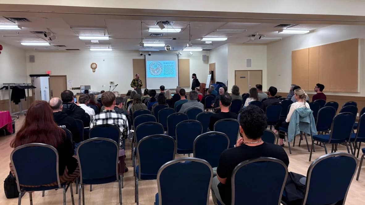
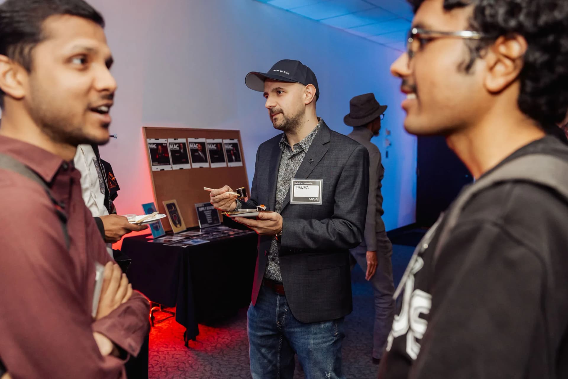
Every image below is a real BC + AI room. That is the whole standard: a picture proves something happened, or it does not belong on the page.
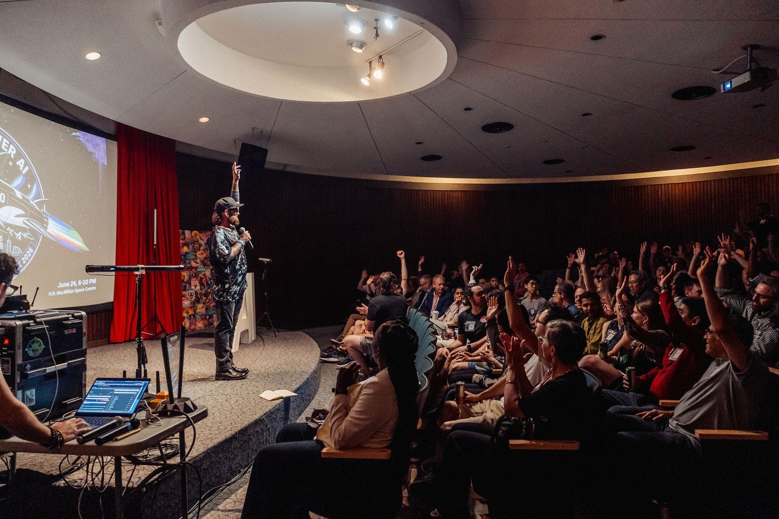
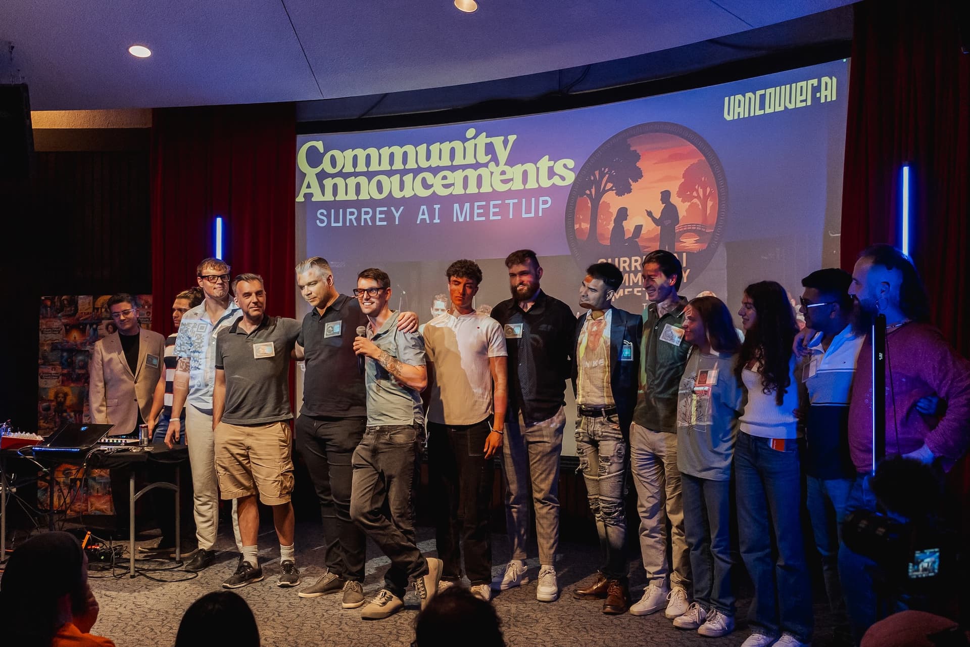
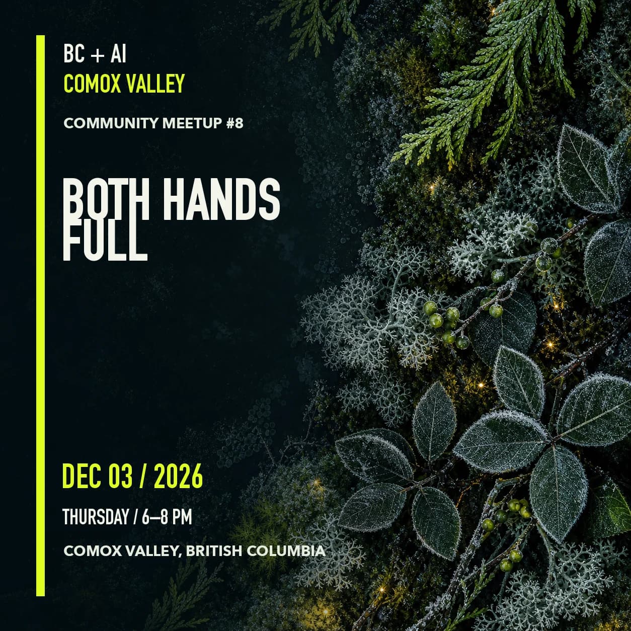
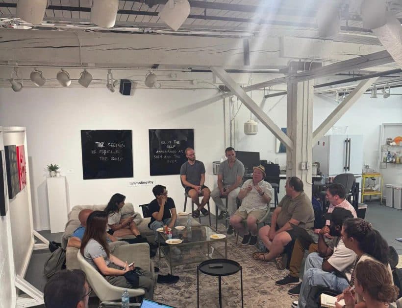
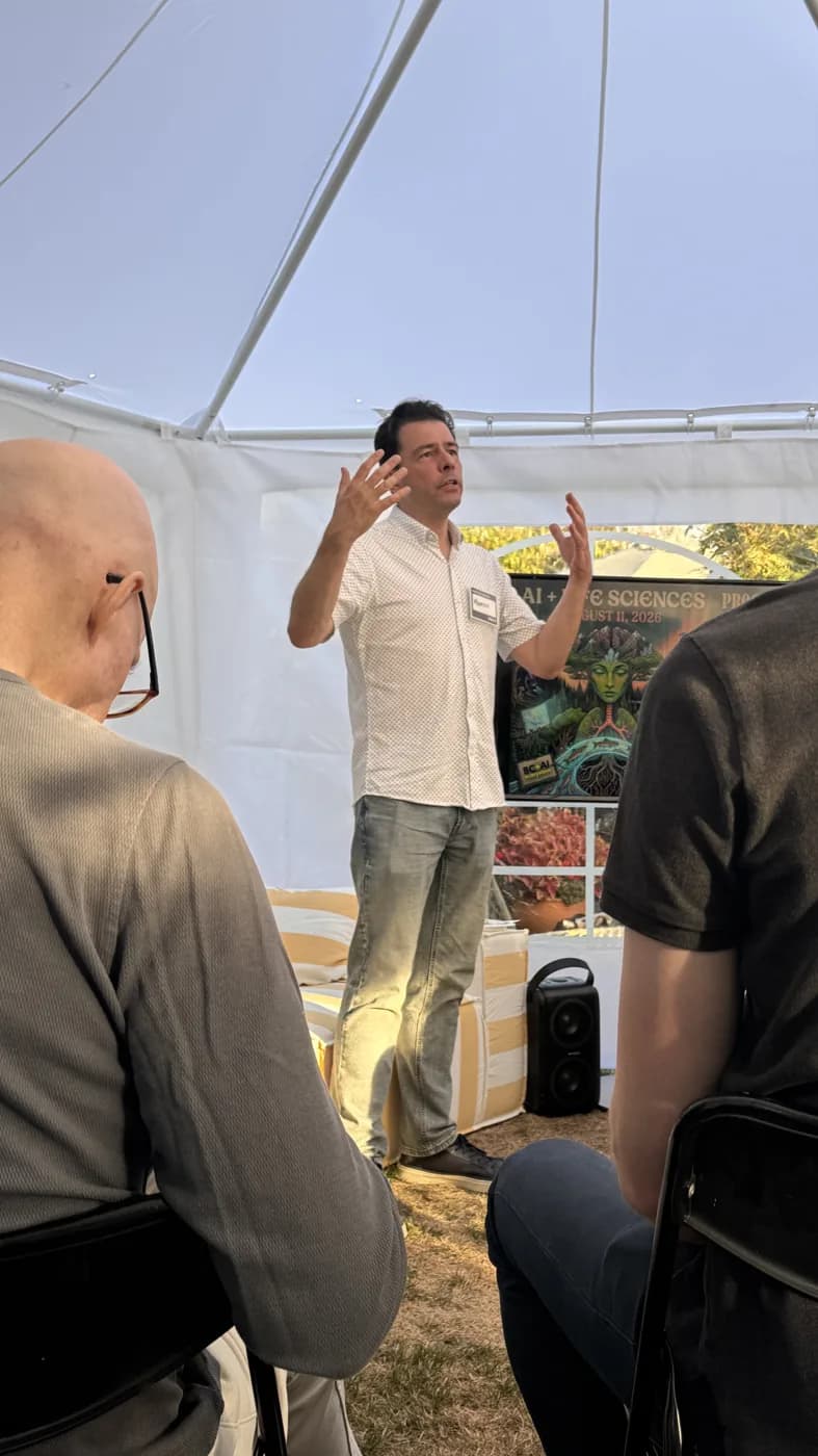
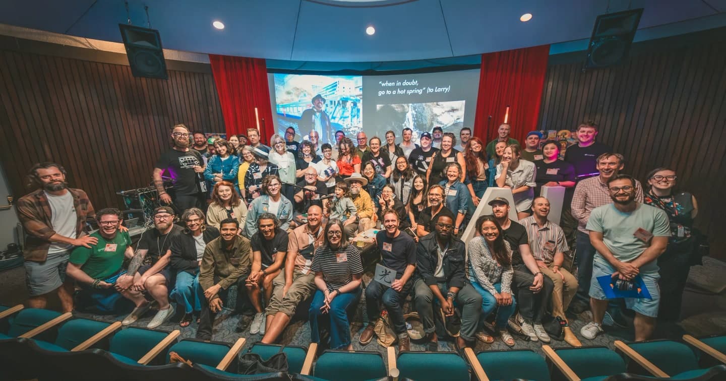
Prefer genuine images of the people, place, program, and event being described.
lib/press-kit/brand-contract.ts
Prominent images need an inspectable subject, source record, creator, and permission trail.
lib/press-kit/brand-contract.ts
Do not use unrelated, stock, or generated imagery as documentary evidence.
lib/press-kit/brand-contract.ts
Communities
A room is a program inside BC + AI, not a sub-brand. It gets no private palette, typeface, or logo. Two things do vary, and both follow a rule.
A room lockup is the organisation wordmark with the room prefix substituted, set identically: mono face, uppercase, 0.18em tracking, a space either side of the plus. Nothing else changes, and no room gets a second typeface or a symbol.
Named, not locked up: AI Film Club, MAC, Life Sciences, Futures Lab, Creativity + Design. Do not invent an initialism for a room that does not have one.
docs/design/design-guidelines-usage-audit.md · lib/press-kit/brand-contract.ts
regional
--bcai-signal-steel
Every regional room shares one signal. A place is a place; Fraser Valley is not a different kind of thing from Comox Valley, so colour is the wrong axis to separate them. They differ through their lockup and their own photography.
docs/design/design-guidelines-usage-audit.md · lib/visual-contract.ts
special interest
One signal each, no two alike
Subject-matter rooms each take a distinct signal, because subject matter is exactly what a reader is being asked to tell apart. No two may hold the same one.
docs/design/design-guidelines-usage-audit.md · lib/visual-contract.ts
FV + AI
regional
--bcai-signal-steel
CV + AI
regional
--bcai-signal-steel
OK + AI
regional
--bcai-signal-steel
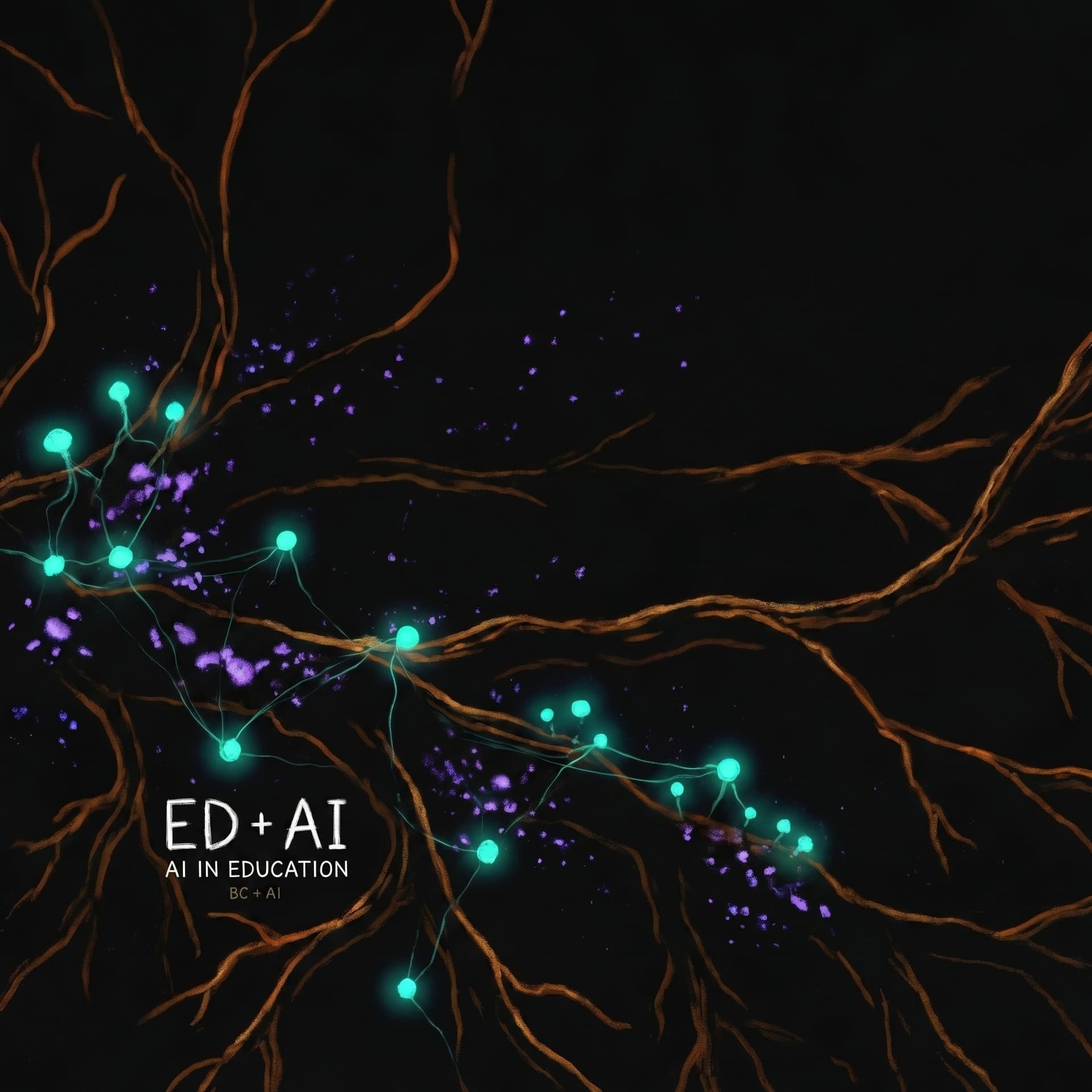
ED + AI
special interest
--bcai-accent-mint
MAC
special interest
--bcai-signal-ice
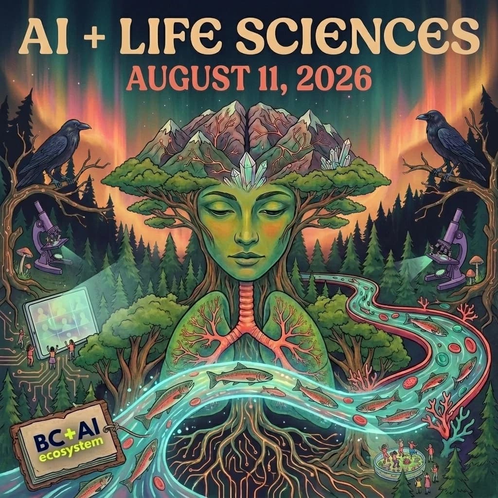
Life Sciences
special interest
--bcai-signal-glacier

AI Film Club
special interest
--bcai-signal-coral
A room may not introduce a colour, typeface, logo, or lockup of its own. Every community route was audited on 2026-09-07 and none does.
lib/visual-contract.ts · docs/design/design-guidelines-usage-audit.md
A signal follows the kind of room, not the room. Regional rooms share steel on purpose. A new regional room takes steel; it does not get to pick.
docs/design/design-guidelines-usage-audit.md
No two special-interest rooms may hold the same signal. A new one takes an unused signal, or the system needs a decision before it launches.
docs/design/design-guidelines-usage-audit.md
The plus-AI lockup is granted, not assumed. A room that does not have one uses its name. Do not invent an initialism for it.
docs/design/design-guidelines-usage-audit.md
Print stylesheets are the one place a literal colour is allowed, because ink on paper is not the screen canvas.
docs/design/design-guidelines-usage-audit.md
lib/visual-contract.ts · docs/design/design-guidelines-usage-audit.md
Spacing
Use Tailwind spacing utilities directly. There is no BC + AI spacing token, and adding one would fork a scale the site already follows.
14px · 0.25rem
Hairline gaps inside a control or between an icon and its label.
28px · 0.5rem
Tight grouping: label to value, chip to chip.
312px · 0.75rem
Default gap between related items in a list or card.
416px · 1rem
Default padding inside a card or small panel.
624px · 1.5rem
Page gutter and separation between distinct blocks.
832px · 2rem
Padding inside a large panel; gap between subsections.
1248px · 3rem
Space between sections within a page region.
1664px · 4rem
Vertical rhythm between major page sections.
2496px · 6rem
Top and bottom of a page, and around a full-bleed break.
docs/design/design-guidelines-usage-audit.md
Radius
Four semantic steps. Reach for the role, not the pixel, so a control and a card cannot drift apart page by page.
Control
--bcai-radius-control
0.5rem
Inputs, chips, and tags. Buttons are square by default and are the exception, not the rule.
app/globals.css · docs/design/design-guidelines-usage-audit.md
Card
--bcai-radius-card
0.75rem
Cards, tiles, and the default rounded container.
app/globals.css · docs/design/design-guidelines-usage-audit.md
Panel
--bcai-radius-panel
1rem
Large panels, sheets, and dialogs.
app/globals.css · docs/design/design-guidelines-usage-audit.md
Pill
--bcai-radius-pill
9999px
Badges, avatars, and status dots. Never a primary button.
app/globals.css · docs/design/design-guidelines-usage-audit.md
Elevation
Three heights on a dark canvas, where a border does most of the work and the shadow only confirms it.
Resting
--bcai-elevation-1
0 2px 12px rgba(0, 0, 0, 0.35)
A card sitting on the canvas. Most cards need only a border.
app/globals.css · docs/design/design-guidelines-usage-audit.md
Raised
--bcai-elevation-2
0 8px 24px rgba(10, 13, 18, 0.45)
Hover, active drag, and panels that lift off the page.
app/globals.css · docs/design/design-guidelines-usage-audit.md
Overlay
--bcai-elevation-3
0 24px 80px rgba(0, 0, 0, 0.28)
Dialogs, menus, and anything that covers the page.
app/globals.css · docs/design/design-guidelines-usage-audit.md
These specimens sit on the paper surface. On the navy canvas all three shadows are near-invisible, which is why the rules below ask for a border.
Pair every elevation with a border token. On the navy canvas a shadow alone reads as a smudge rather than a height.
app/globals.css
Glow is a separate axis and means signal, not elevation. Never put a glow utility and an elevation token on the same element.
app/globals.css
Layout
Two content widths carry the whole site. Pick by density, not by taste.
Content
--bcai-content
72rem
Default maximum width for reading and standard page sections.
app/globals.css
Wide content
--bcai-content-wide
90rem
Galleries, dense grids, and full-bleed-adjacent composition.
app/globals.css
Hold a 24px page gutter on small screens and let the max width do the rest.
docs/design/design-guidelines-usage-audit.md
Gaps
Stated plainly, because a guidelines page that hides its holes sends people off to invent their own answer.
There is no BC + AI icon system. Icons are chosen per surface today. Until one is adopted, do not introduce a new icon family without a governance decision.
docs/design/design-guidelines-usage-audit.md
The press kit still offers the DNA-helix square as a downloadable logo mark, while governance records that identifier as superseded. Until that asset is replaced or withdrawn, anyone downloading a BC + AI logo receives the retired identity. Use the wordmark.
lib/press-kit/brand-contract.ts · docs/design/design-guidelines-usage-audit.md
There is no vector or image mark at all, retired helix aside. The identity is typographic, so large-format use sets the wordmark in Geist Mono rather than scaling a file.
lib/press-kit/brand-contract.ts
Some arbitrary shadow values predate the elevation tokens. New work uses the tokens, but most of those values are accent glows and must stay as they are: converting a glow to an elevation would break the signal system. Check which axis a shadow belongs to before touching it.
docs/design/design-guidelines-usage-audit.md · app/globals.css
Sources
Every rule above cites the file it resolves from. Change the file first, then the contract.
Live global tokens
app/globals.css
Reviewed
Shared button component
components/ui/Button.tsx
Reviewed
Route and community visual contract
lib/visual-contract.ts
Reviewed
Live usage audit, 2026-09-07
docs/design/design-guidelines-usage-audit.md
Reviewed
Press-kit brand contract
lib/press-kit/brand-contract.ts
Reviewed